Comparing apples to oranges is an old and well-worn idiom, found in many cultures and languages, illustrating the idea that similar yet different things are not necessarily comparable.
The use of photos, especially the alteration of imagery via Photoshop or other image altering software, to give a false or misleading portrayal of a product, service or news event is always a hot topic. The folks at the Wall Street Journal (WSJ) have committed a cardinal sin of photo deception without the use of Photoshop or any other image altering software. They did it the old fashioned way of image comparison, editing, and placement in this article. To us, they were not comparing apples to apples, but rather apples to snowballs.
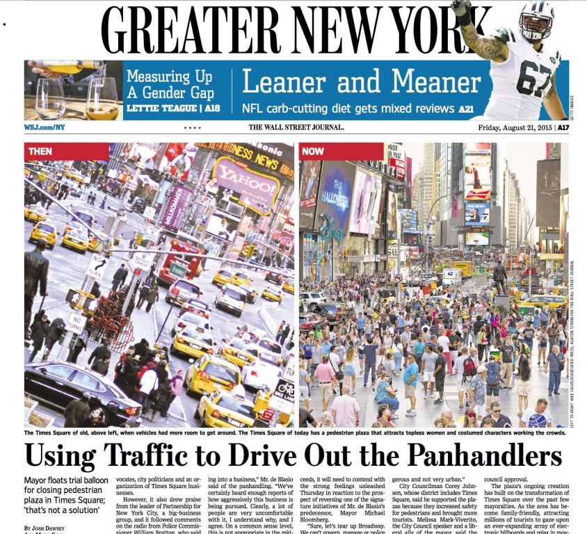
Two images were placed side by side above the article shown above and linked here, discussing the relative merits of having made Times Square into a “car free, pedestrian zone”. There has been a lot of local and national coverage of the issue because 1) Times Square is the number one tourist destination in America and 2) naked, body-painted women and other aggressive panhandlers have been driving business away from retail shops and “white collar” businesses in the area. The area was converted a few years ago from having car thoroughfare streets to being a pedestrian plaza devoid of cars.
Note that the image on the left is labeled “THEN” and on the right, “NOW”. The photos purport to show the differences at the same location in effect, pre and post establishment of the pedestrian plaza. Such use creates a blatantly false impression/result. Here’s why:
The photo on the left was taken during the winter when there are typically few pedestrians in any northern city at any given time. Note the pedestrians wearing heavy winter coats, hats and long jackets. The photo on the right however, was taken during a warm weather month. There are no coats on any of the subjects, indeed most of the pedestrians appear to be tourists and are wearing shorts.
The photos are taken from two different angles and do not portray the same location. As reference points note the position(s) of the statues and buildings in Times Square relative to the point of view of the photos. The photo on the left has the George M. Cohan statue on near left border; photo on right has the same statue on the far right in the distance.
The photo on left was taken at an angle from some height, the one on the right is a “pure vertical” shot which appears to have been shot from a much lower height than the former image. There is no sky visible in the “left” photo whereas a gray cloudless sky is viewable on the “right” one. There is/are no dates of creation nor any references to the time of day/day of the week/month of the year either of the photos in the article were shot.
There is the misleading “THEN” and “NOW”. This is the journalistic equivalent of weight loss products employing the FTC disfavored terms, “Before” and “After”. The photo credits appearing vertically on the border of the photo on the right do not serve to clarify or enlighten any of the above issues in any way.
The only accurate thing to say about these two images is that one was taken sometime prior to the installation of the plaza and one was taken sometime after the creation of the plaza. Since a photo credit was given for each image, the WSJ obviously had access to the creation dates of each photo. The WSJ could simply have posted two images, taken from the same point of view with attendant dates of creation accompanying each image, ie August, 2005 and August, 2015. That would be comparing apples to apples, not apples to snowballs.
One reason (among the many) for the decline in the sales of newspapers is their increasing degree of unreliability. Incidents like this can’t serve to help circulation because there were no doubt thousands of “news junkies” and readers unaffiliated with photography or publishing that noticed this. (Note that celebrity magazines like US and OK, have regular features where readers are asked to spot the differences between two seemingly identical photos)
You can’t blame the authors of the piece for how newspapers are being run in 2015. We requested that the reporters who wrote this piece ask the photo editor -or whoever was attempting to illustrate the article via the use of these images – contact us but we have not as yet received a reply.
It is disappointing, but utterly unsurprising, that even at such a reliable publication as the WSJ, things like this occur.


